Metron Visual Design
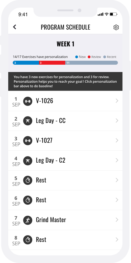
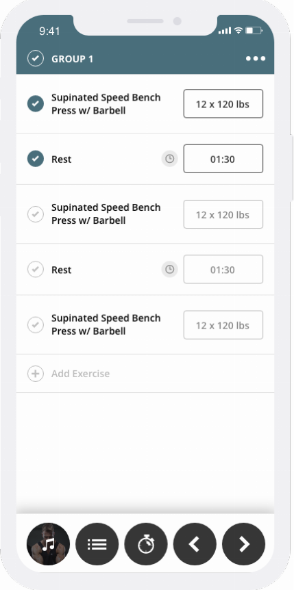
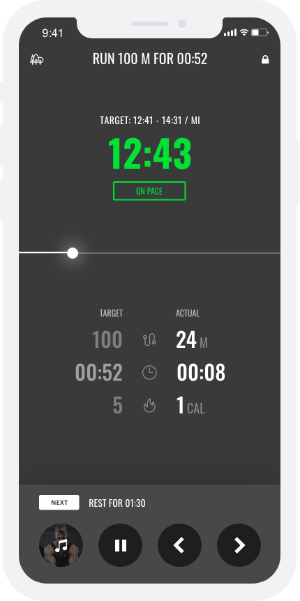
To further improve Metron Fitness, I worked with the designers to update the overall visual look. The app previously evolved from a web mobile version. It doesn’t feel like mobile app, more like a mobile browser. The contents are disorganized and it is hard to distinguish where to navigate. My visual design choice is to engage users, draw their attention to the most important areas of each screen and easily allow them to complete the workout without distractions
Color
I eliminated unnecessary color usage to keep the interface cleaner. Initially, Metron’s CEO wanted to keep the red for the brand. Turquoise gray balances out the hotness of red. Black and gray also neutralize the red.

Components
One of my main design goals was to ensure I did not disrupt or significantly change Metron’s current design system. All new components and design solutions can be easily integrated into Metron’s current mobile app without any major friction areas for users

Final design deliverables


